


VV
Foundations
VV Foundations — Design System Development & Scaling
VV Foundations
Overview
VV Foundations is an internal design system created for studio projects and used as a unified foundation for interface design
The system brings together primitives, semantic rules, and components, enabling teams to work within a shared visual and logical framework while maintaining interface consistency across multiple products
The design system evolved iteratively and was applied in real-world projects, helping streamline design processes and increase overall team efficiency
Role
UX/UI Designer
Key Responsibilities
Design system development, token creation, component unification, and state standardization
Team
UX/UI Designer, Lead UX Designer, Frontend Developer
Timeline
6 months
Problem Statement
In a studio environment working on multiple projects, there was no unified system for interface design. As a result, products evolved in isolation, which over time led to inconsistencies in visual decisions and difficulties with scaling
The goal was to create a single foundation that would allow the team to design interfaces consistently and manage changes centrally, regardless of the project type or its stage
As a result, a design system was created as a single source of truth for tokens, variables, components, patterns, and styles. This helped reduce inconsistencies between projects, minimize repetitive work, and enable faster interface production through reusable solutions


Internal Audit
An analysis of work across multiple studio projects revealed systemic issues: solutions were repeatedly recreated from scratch, components were built locally for each project, and interface parameters varied from one product to another. The lack of centralized tokens and variables slowed down development, made maintenance more complex, and required manual synchronization of changes
Repeated Solutions
Inconsistent Parameters
Local Components
Design System Analysis
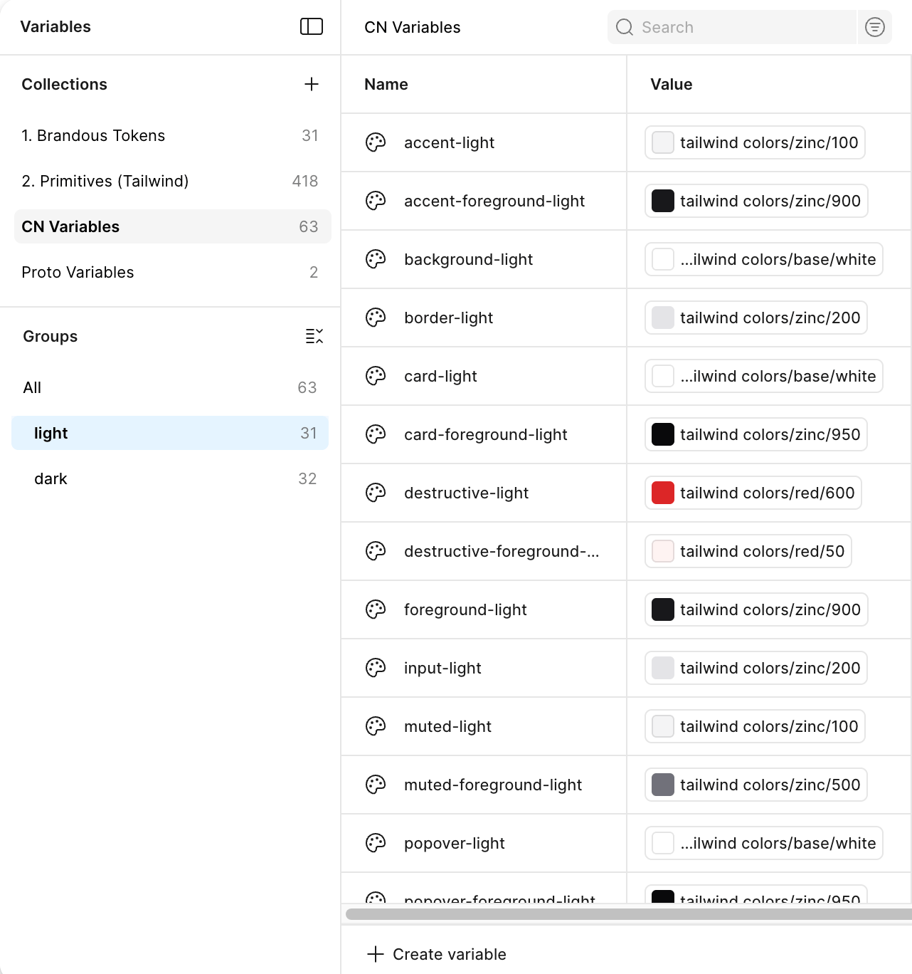
During the development of VV Foundations, the structure of mature design systems and UI libraries was studied, with a focus on tokens, components, and interface scalability. As references, the following systems were analyzed: Tailwind CSS, Polaris, Shadcn UI, Atlassian Design System, Untitled UI, Adobe Spectrum, Lightning Design System, and Ant Design
Analyzed Design Systems


Spectrum


Polaris


Mature design systems are built on a hierarchy that moves from primitives and semantics to components and patterns — this approach became the foundation of VV Foundations
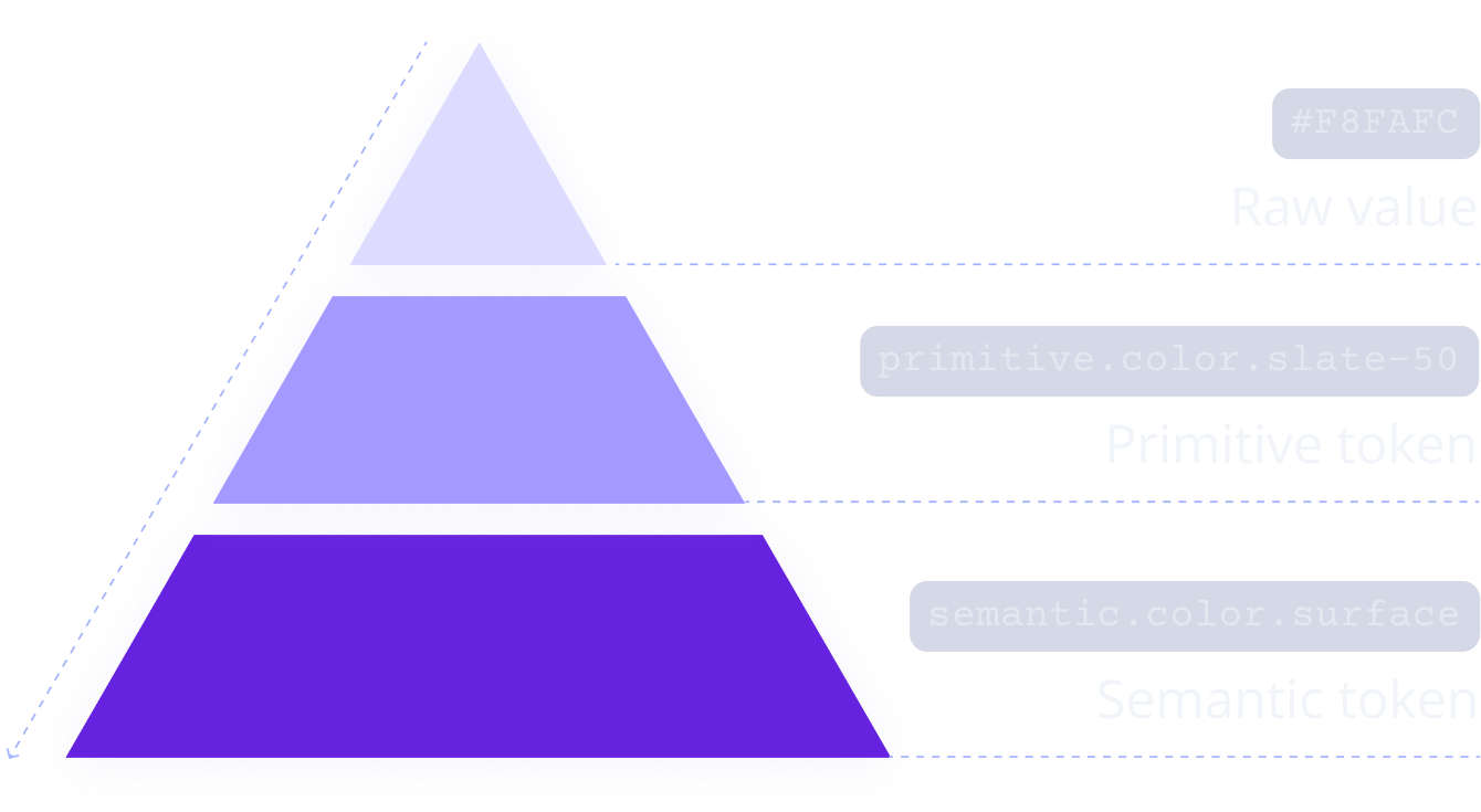
VV Foundation Token Architecture
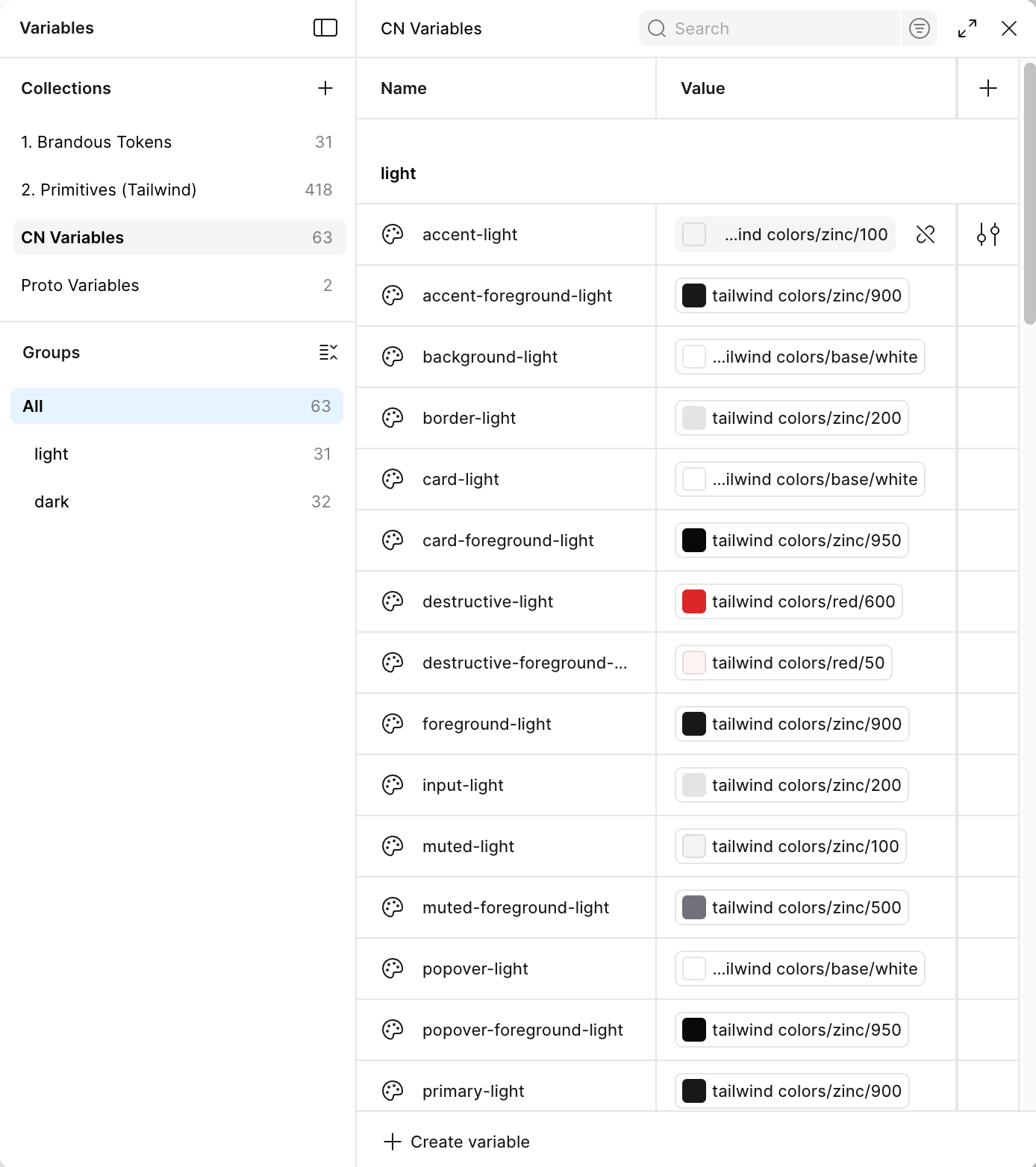
A two-level token architecture was intentionally chosen in the system — without unnecessary complexity. Primitives contain raw values, while semantic tokens define their role within the interface. This approach provides sufficient flexibility, scalability, and a comfortable workflow

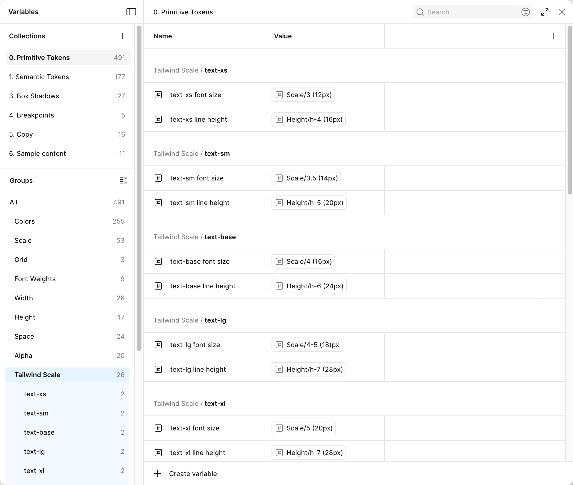
Design Tokens
Design tokens describe all key visual parameters of the interface (typography, color, sizing, spacing) through primitive and semantic layers, ensuring consistency, reusability, and seamless integration with code. As a foundation, proven Tailwind CSS scales were used — without excessive customization or unnecessary complexity
Typography
Colors
sizes

Token Usage
Each interface element is linked to the token system: changes at the base automatically scale across the entire UI without manual component adjustments

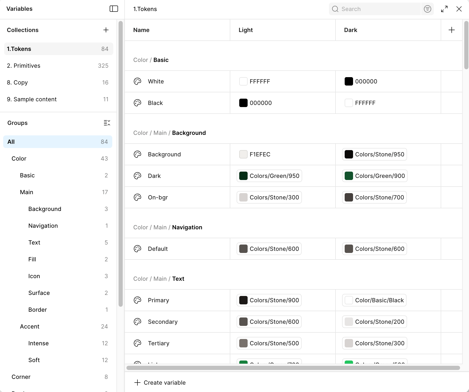
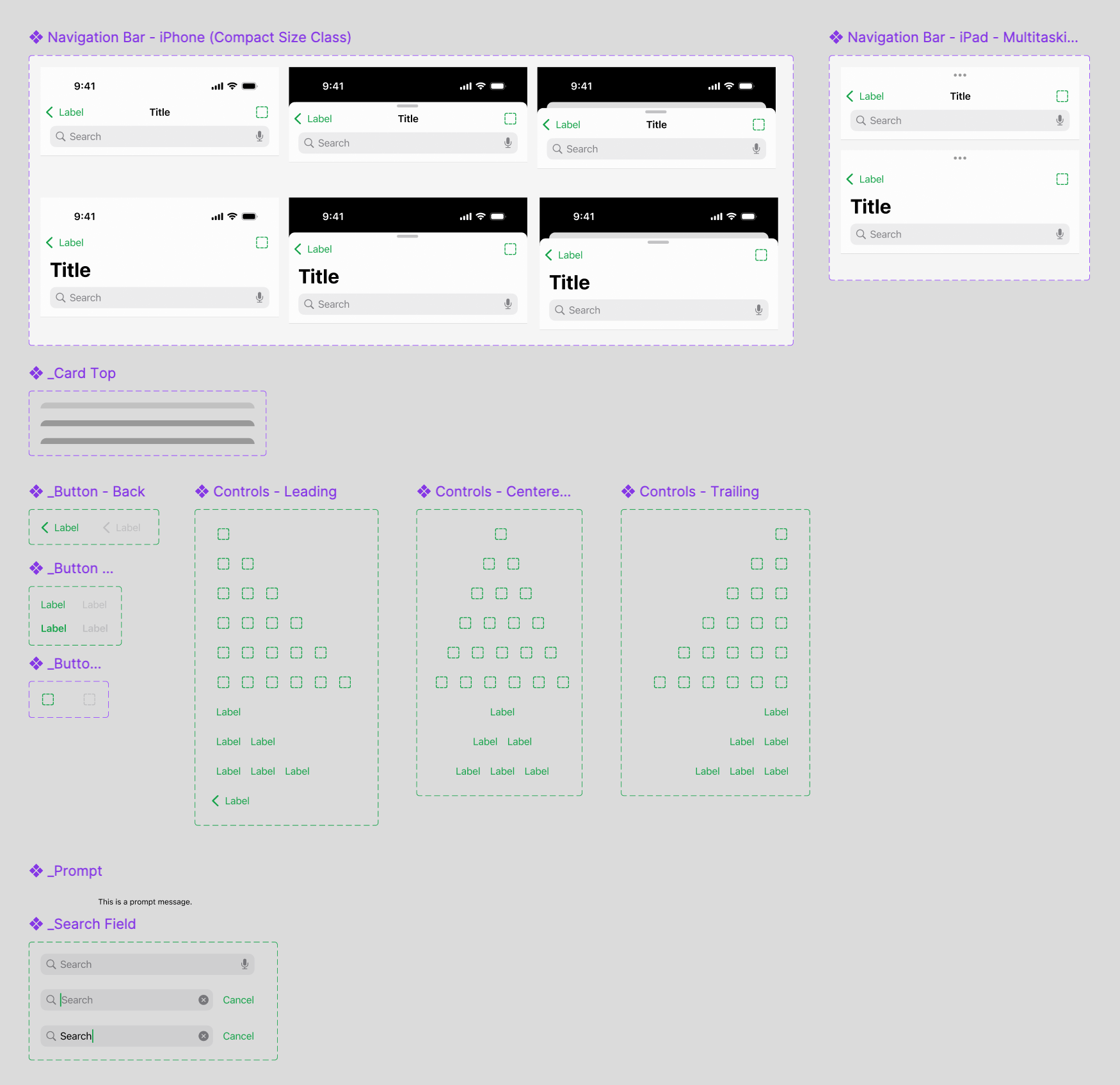
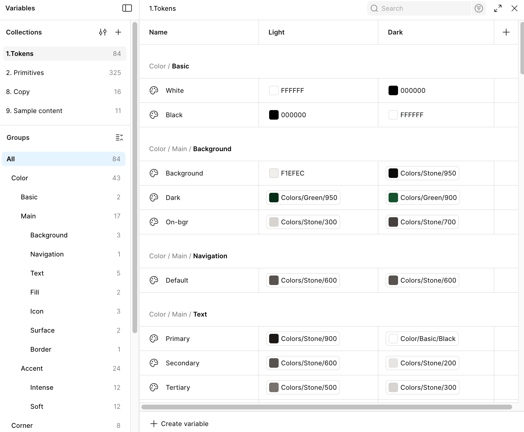
Design System Structure
This is a unified workspace: tokens, styles, components, and documentation are structured by levels and interconnected for easy navigation and maintenance

Components
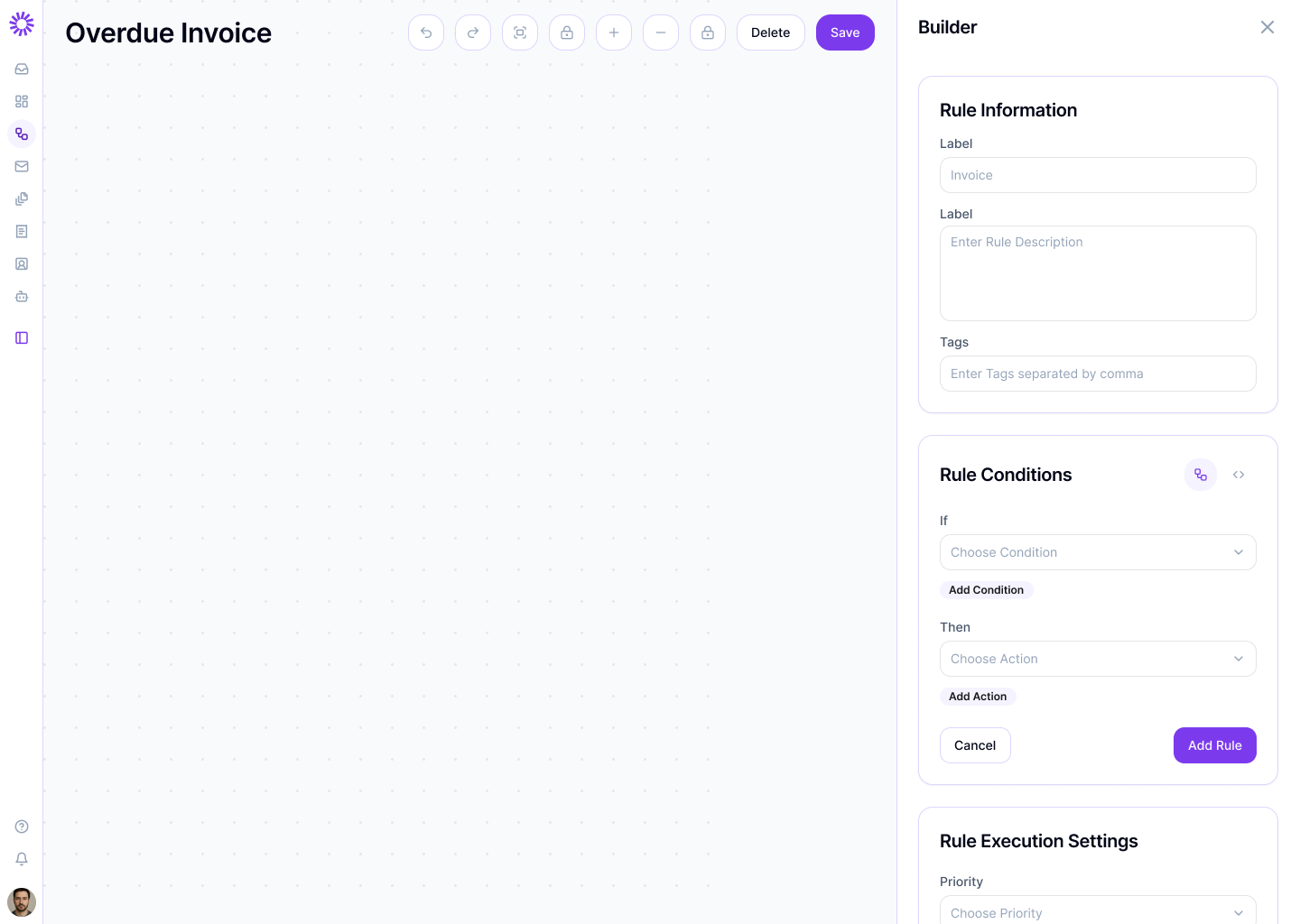
Components are built on tokens and variables and are controlled parametrically. This allows maintaining interface consistency and scaling the design system without increasing structural complexity

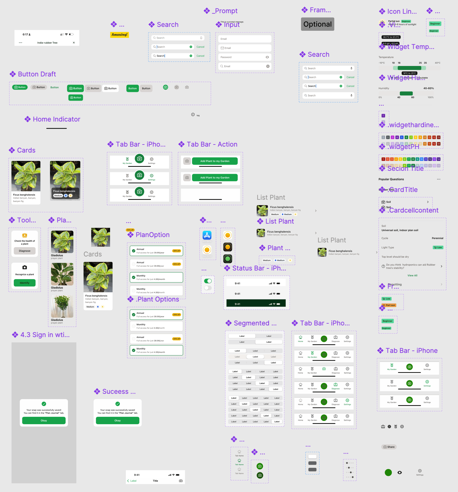
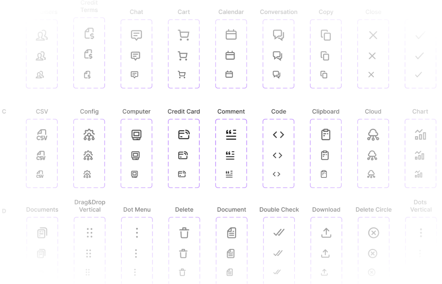
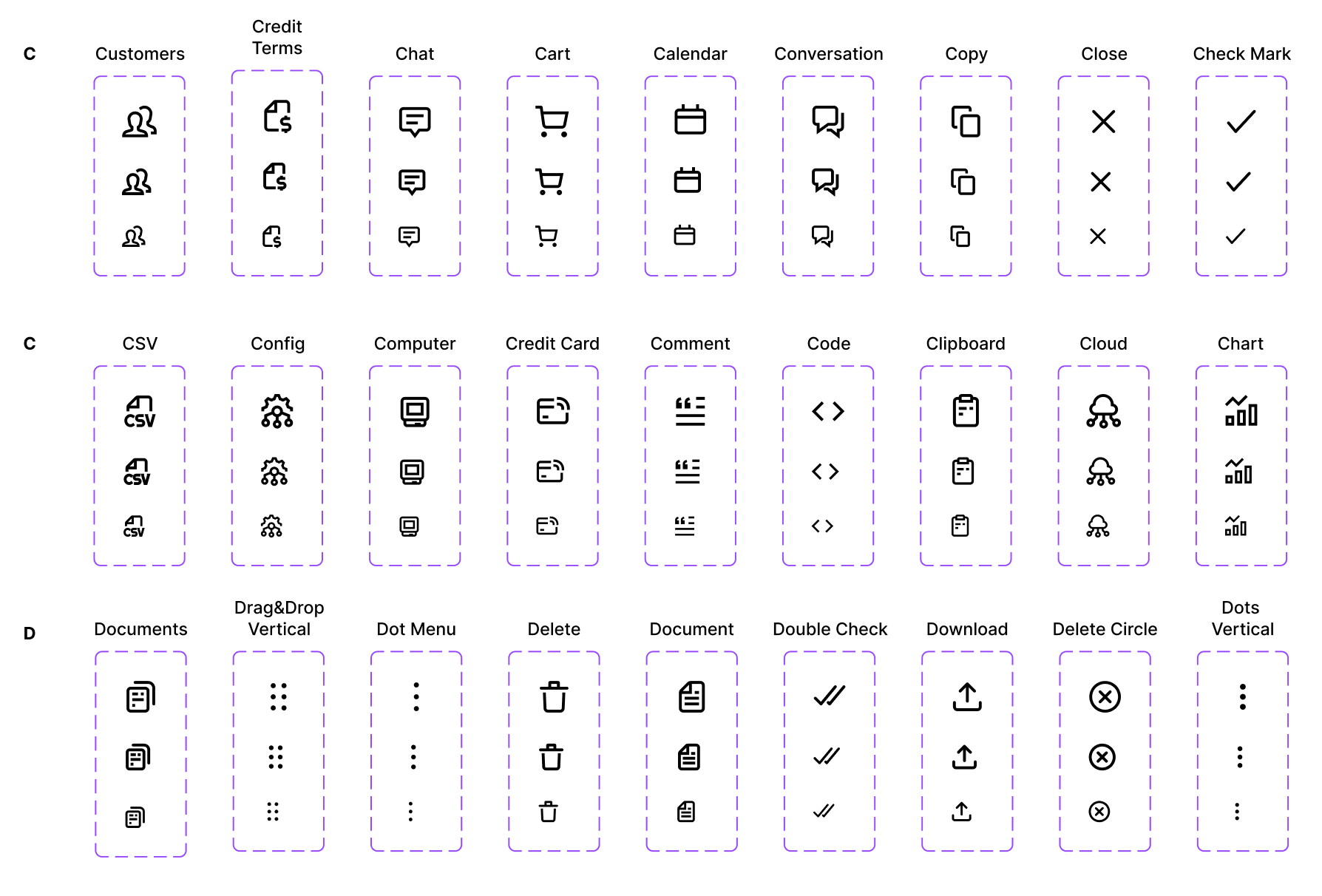
Icon Library
A base set of 300+ icons has been created and integrated into the design system. Sizes 16px / 20px / 24px are used as standardized options, ensuring consistent scale and visual alignment across all components. All icons are designed in a unified style

Conclusion
The VV Foundations project became a practical exploration of how a mature design system should work — from token architecture to parametric components and a clear, well-structured foundation. The system was designed to simplify scaling, maintain a unified visual language, and reduce the number of errors
This project strengthened my experience in designing design systems, working with variables and component architecture, and helped me develop a more engineering- and product-oriented approach to design

See also

CRYPTO EXCHANGE
E-COMMERCE PLATFORM
Mobile application

Inspection Platform

Brand identity & logo


VV
Foundations
VV Foundations — Design System Development & Scaling
VV Foundations
Overview
VV Foundations is an internal design system created for studio projects and used as a unified foundation for interface design
The system brings together primitives, semantic rules, and components, enabling teams to work within a shared visual and logical framework while maintaining interface consistency across multiple products
The design system evolved iteratively and was applied in real-world projects, helping streamline design processes and increase overall team efficiency
Role
UX/UI Designer
Key Responsibilities
Design system development, token creation, component unification, and state standardization
Team
UX/UI Designer, Lead UX Designer, Frontend Developer
Timeline
6 months
Problem Statement
In a studio environment working on multiple projects, there was no unified system for interface design. As a result, products evolved in isolation, which over time led to inconsistencies in visual decisions and difficulties with scaling
The goal was to create a single foundation that would allow the team to design interfaces consistently and manage changes centrally, regardless of the project type or its stage
As a result, a design system was created as a single source of truth for tokens, variables, components, patterns, and styles. This helped reduce inconsistencies between projects, minimize repetitive work, and enable faster interface production through reusable solutions


Internal Audit
An analysis of work across multiple studio projects revealed systemic issues: solutions were repeatedly recreated from scratch, components were built locally for each project, and interface parameters varied from one product to another. The lack of centralized tokens and variables slowed down development, made maintenance more complex, and required manual synchronization of changes
Repeated Solutions
Inconsistent Parameters
Local Components
Design System Analysis
During the development of VV Foundations, the structure of mature design systems and UI libraries was studied, with a focus on tokens, components, and interface scalability. As references, the following systems were analyzed: Tailwind CSS, Polaris, Shadcn UI, Atlassian Design System, Untitled UI, Adobe Spectrum, Lightning Design System, and Ant Design
Analyzed Design Systems
Spectrum
Polaris
Mature design systems are built on a hierarchy that moves from primitives and semantics to components and patterns — this approach became the foundation of VV Foundations
VV Foundation Token Architecture
A two-level token architecture was intentionally chosen in the system — without unnecessary complexity. Primitives contain raw values, while semantic tokens define their role within the interface. This approach provides sufficient flexibility, scalability, and a comfortable workflow

Design Tokens
Design tokens describe all key visual parameters of the interface (typography, color, sizing, spacing) through primitive and semantic layers, ensuring consistency, reusability, and seamless integration with code. As a foundation, proven Tailwind CSS scales were used — without excessive customization or unnecessary complexity
Typography
Colors
sizes

Token Usage
Each interface element is linked to the token system: changes at the base automatically scale across the entire UI without manual component adjustments

Design System Structure
This is a unified workspace: tokens, styles, components, and documentation are structured by levels and interconnected for easy navigation and maintenance

Components
Components are built on tokens and variables and are controlled parametrically. This allows maintaining interface consistency and scaling the design system without increasing structural complexity

Icon Library
A base set of 300+ icons has been created and integrated into the design system. Sizes 16px / 20px / 24px are used as standardized options, ensuring consistent scale and visual alignment across all components. All icons are designed in a unified style

Conclusion
The VV Foundations project became a practical exploration of how a mature design system should work — from token architecture to parametric components and a clear, well-structured foundation. The system was designed to simplify scaling, maintain a unified visual language, and reduce the number of errors
This project strengthened my experience in designing design systems, working with variables and component architecture, and helped me develop a more engineering- and product-oriented approach to design

See also
CRYPTO EXCHANGE
E-COMMERCE PLATFORM
Mobile application
Inspection Platform
Brand identity & logo


VV
Foundations
VV Foundations — Design System Development & Scaling
VV Foundations
Overview
VV Foundations is an internal design system created for studio projects and used as a unified foundation for interface design
The system brings together primitives, semantic rules, and components, enabling teams to work within a shared visual and logical framework while maintaining interface consistency across multiple products
The design system evolved iteratively and was applied in real-world projects, helping streamline design processes and increase overall team efficiency
Role
UX/UI Designer
Key Responsibilities
Design system development, token creation, component unification, and state standardization
Team
UX/UI Designer, Lead UX Designer, Frontend Developer
Timeline
6 months
Problem Statement
In a studio environment working on multiple projects, there was no unified system for interface design. As a result, products evolved in isolation, which over time led to inconsistencies in visual decisions and difficulties with scaling
The goal was to create a single foundation that would allow the team to design interfaces consistently and manage changes centrally, regardless of the project type or its stage
As a result, a design system was created as a single source of truth for tokens, variables, components, patterns, and styles. This helped reduce inconsistencies between projects, minimize repetitive work, and enable faster interface production through reusable solutions


Internal Audit
An analysis of work across multiple studio projects revealed systemic issues: solutions were repeatedly recreated from scratch, components were built locally for each project, and interface parameters varied from one product to another. The lack of centralized tokens and variables slowed down development, made maintenance more complex, and required manual synchronization of changes
Repeated Solutions
Inconsistent Parameters
Local Components


Design System Analysis
During the development of VV Foundations, the structure of mature design systems and UI libraries was studied, with a focus on tokens, components, and interface scalability. As references, the following systems were analyzed: Tailwind CSS, Polaris, Shadcn UI, Atlassian Design System, Untitled UI, Adobe Spectrum, Lightning Design System, and Ant Design
Analyzed Design Systems

Spectrum


Polaris

Mature design systems are built on a hierarchy that moves from primitives and semantics to components and patterns — this approach became the foundation of VV Foundations


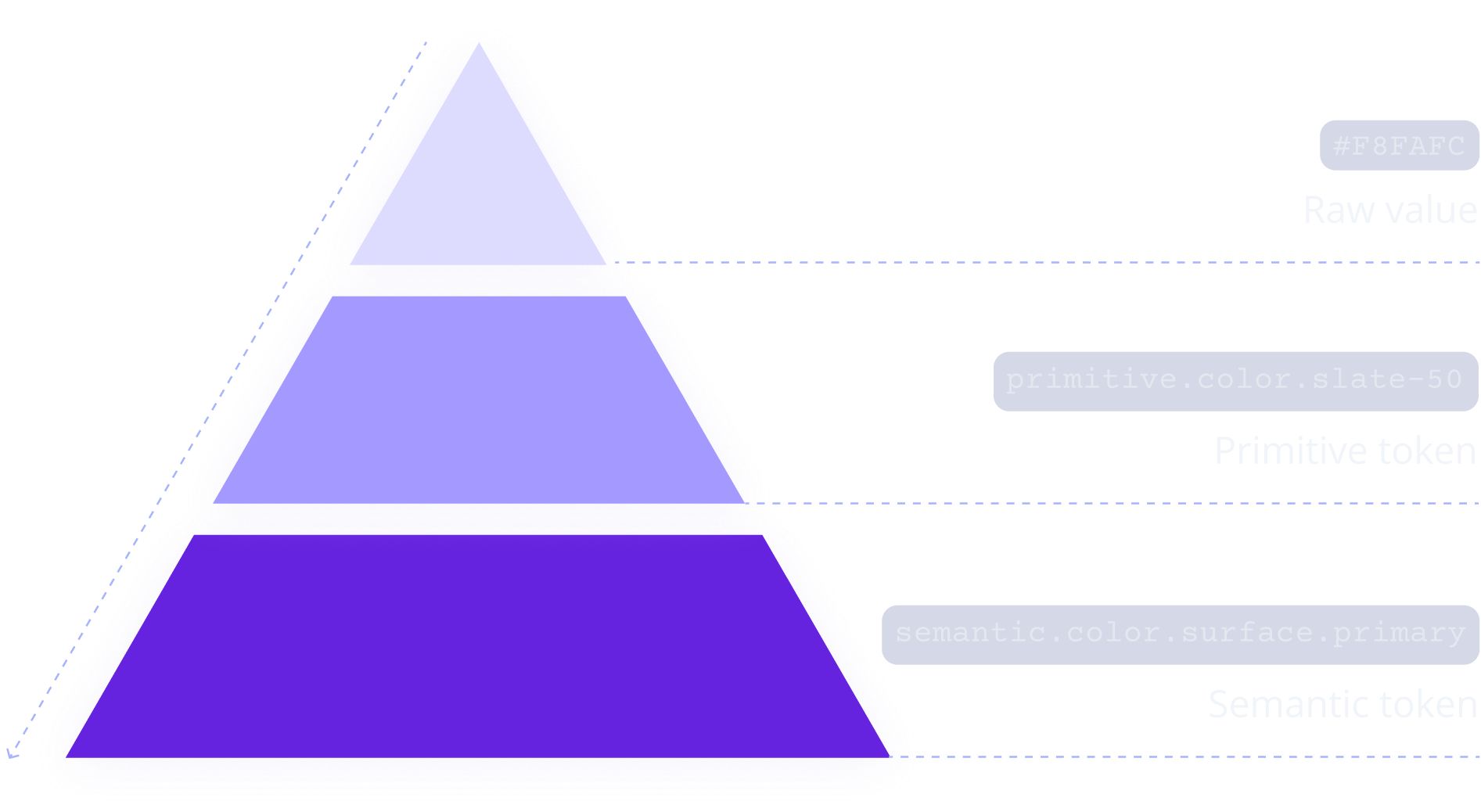
VV Foundation Token Architecture
A two-level token architecture was intentionally chosen in the system — without unnecessary complexity. Primitives contain raw values, while semantic tokens define their role within the interface. This approach provides sufficient flexibility, scalability, and a comfortable workflow

#F8FAFC
Raw value

primitive.color.slate-50
Primitive token

semantic.color.surface.primary
Semantic token


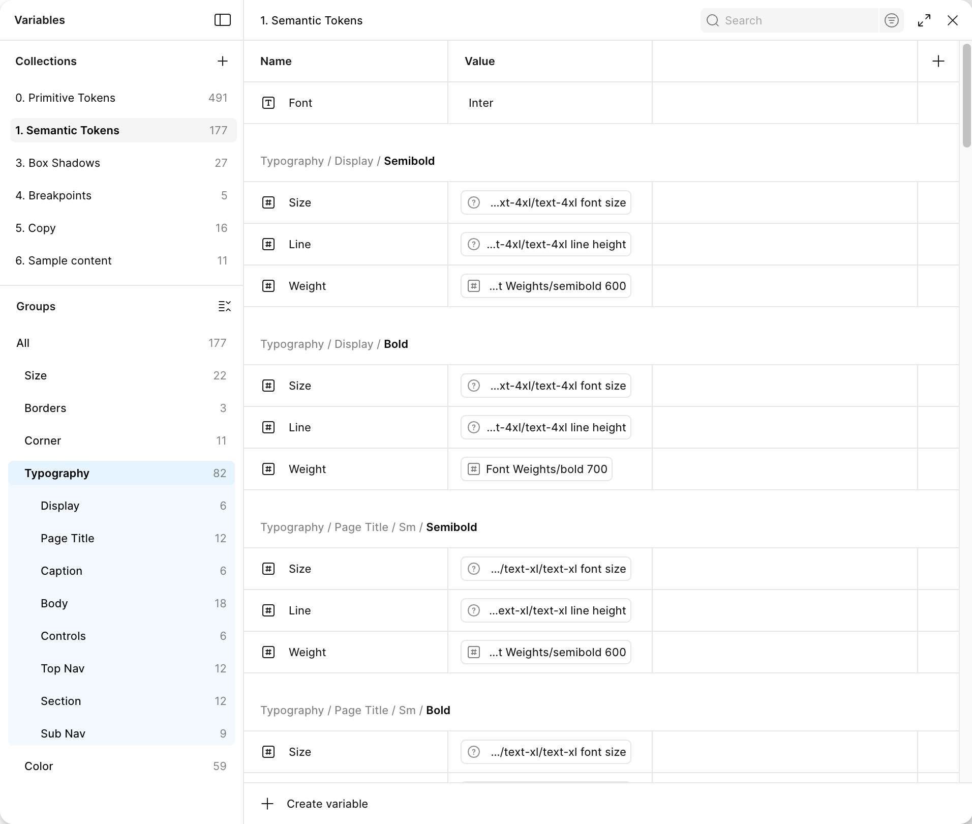
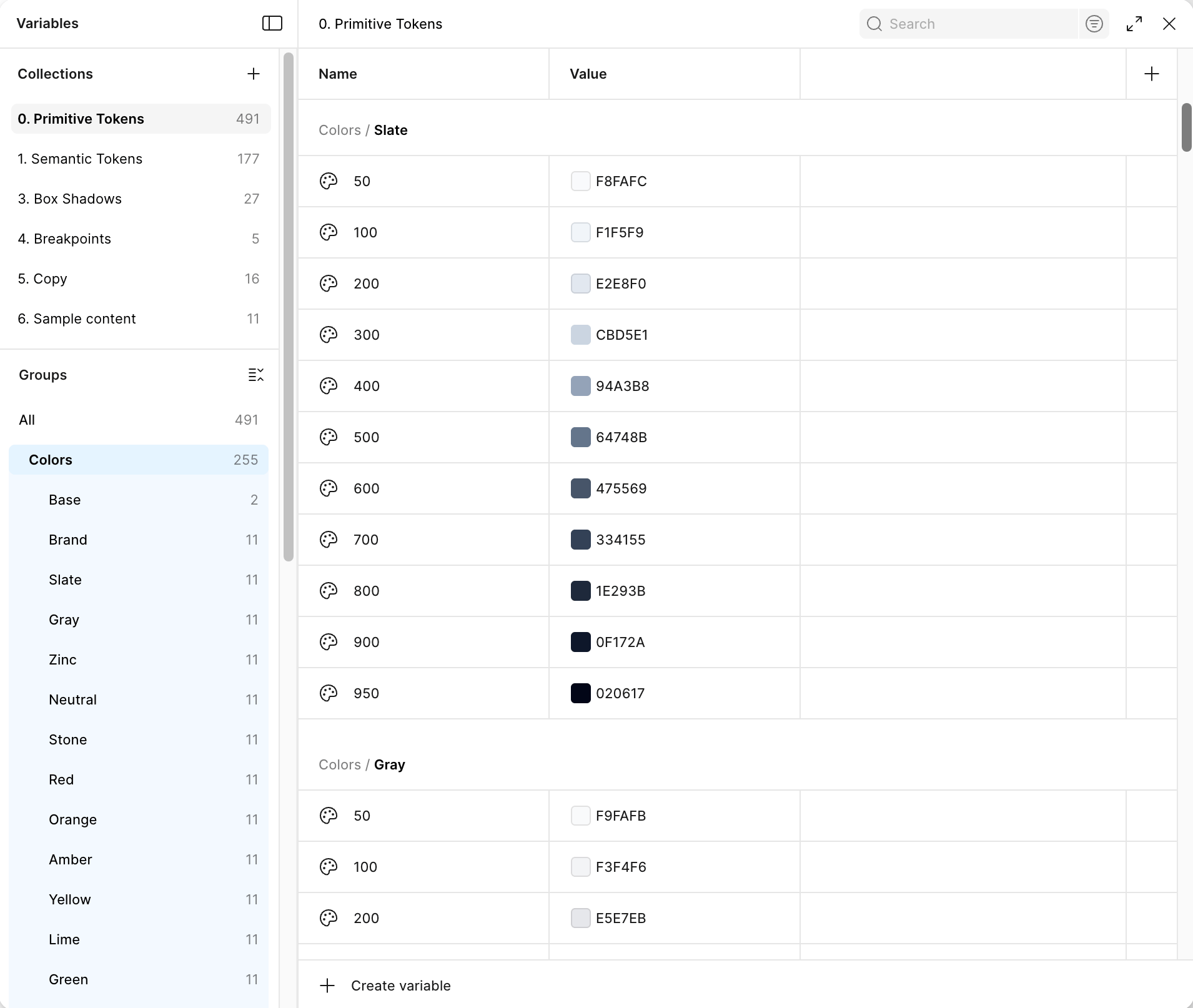
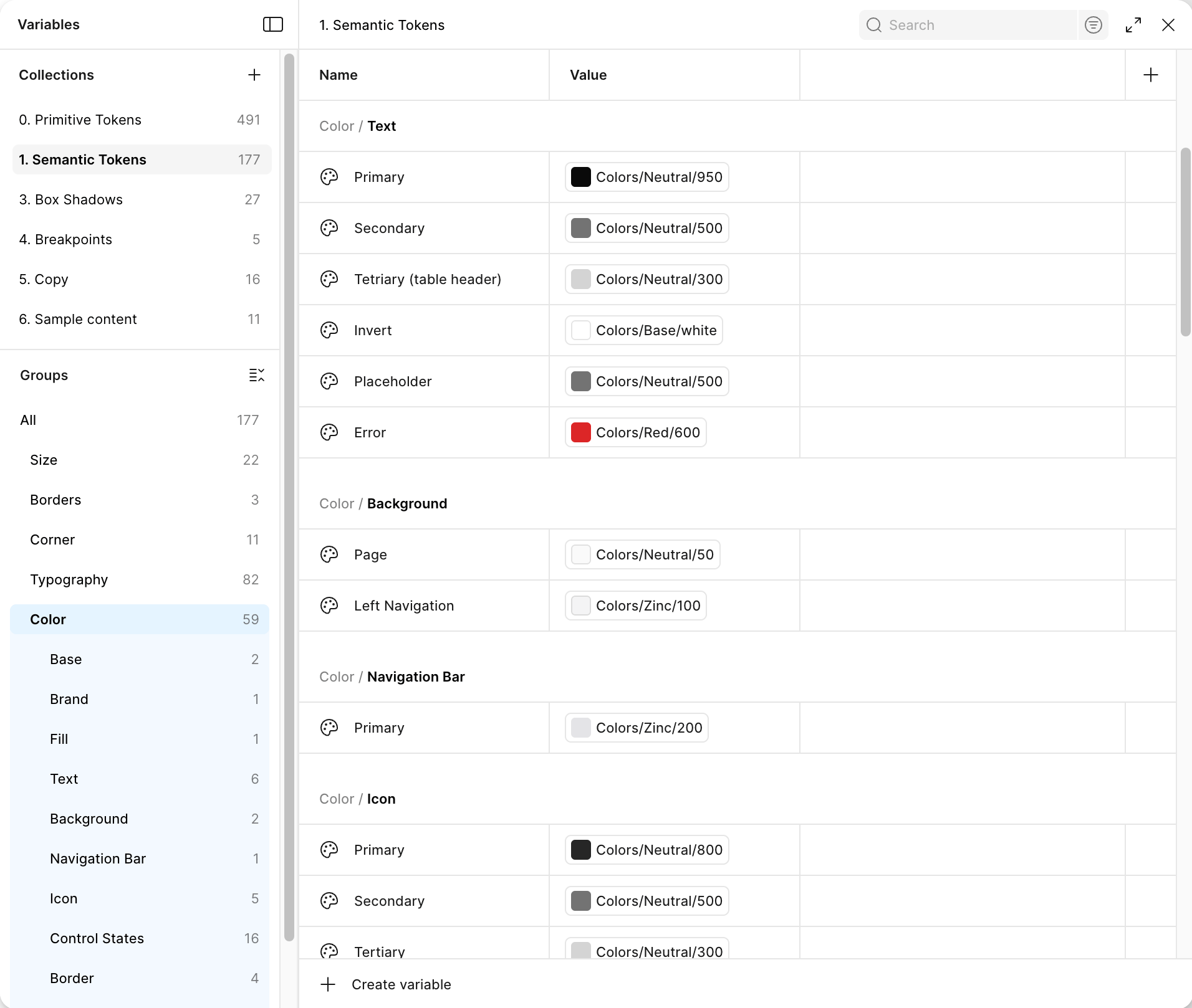
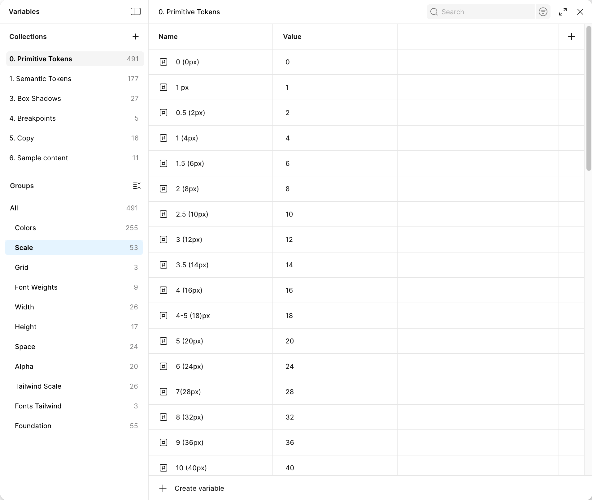
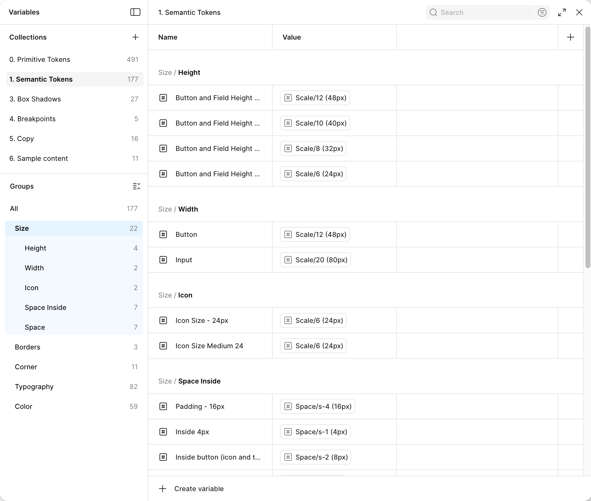
Design Tokens
Design tokens describe all key visual parameters of the interface (typography, color, sizing, spacing) through primitive and semantic layers, ensuring consistency, reusability, and seamless integration with code. As a foundation, proven Tailwind CSS scales were used — without excessive customization or unnecessary complexity
Colors
Primitive
Semantic
Sizes
Primitive
Semantic

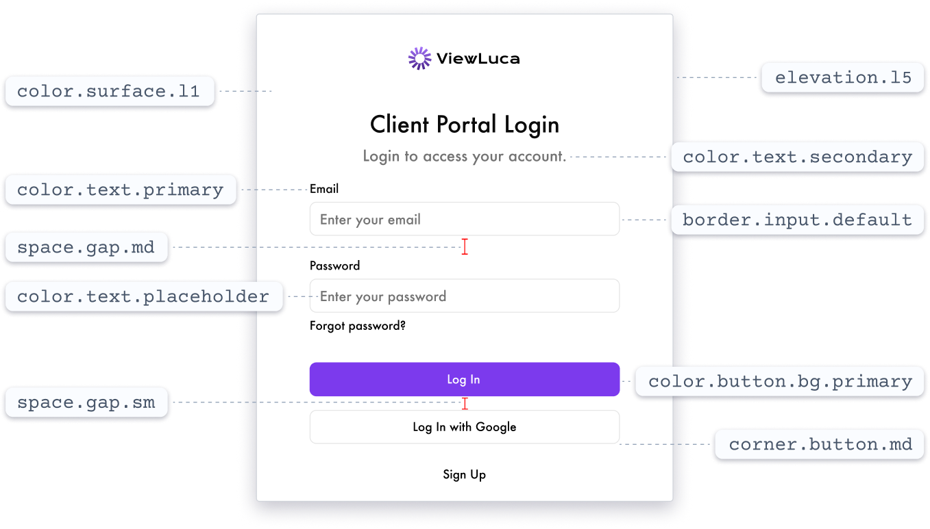
Token Usage
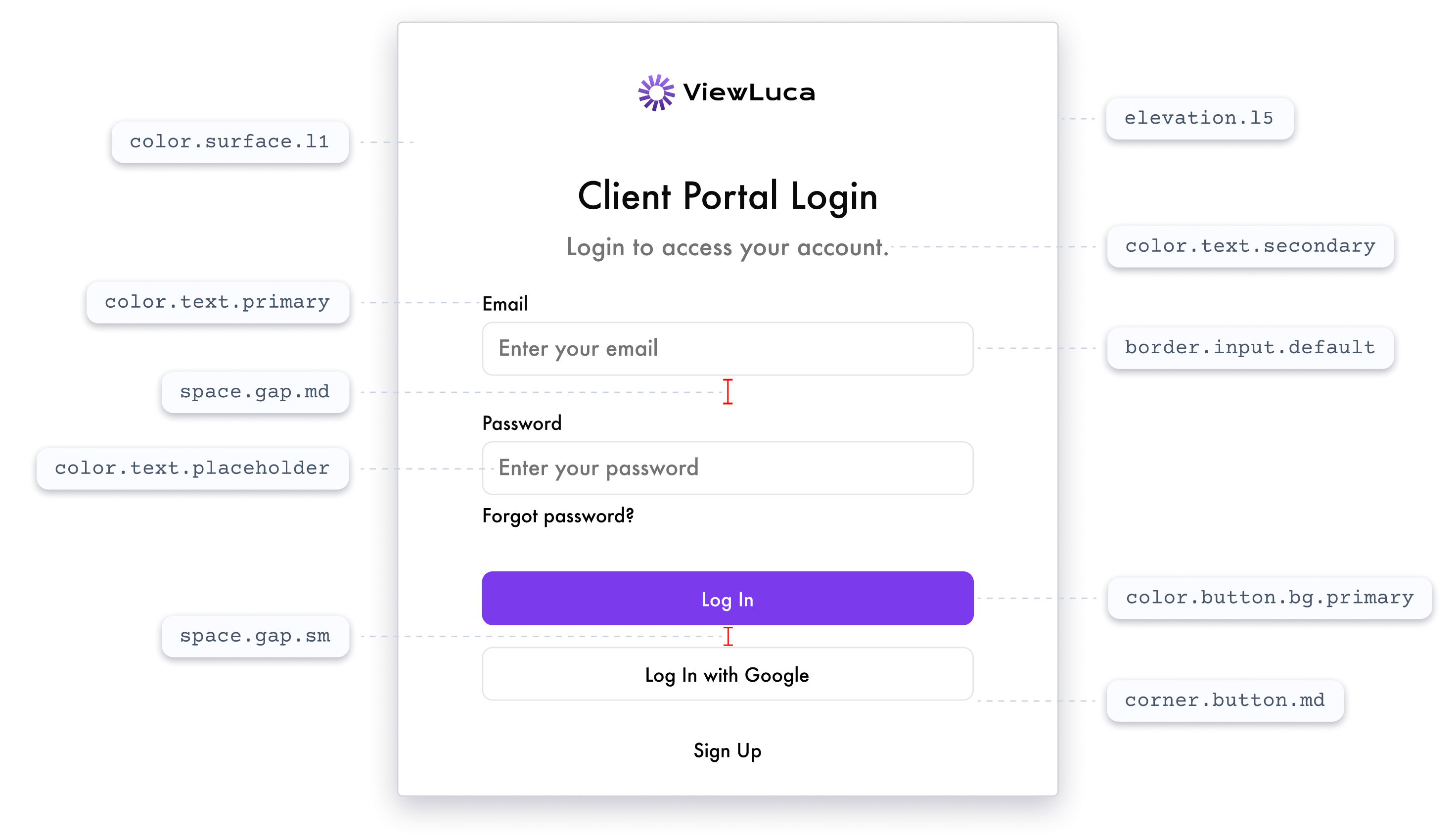
Each interface element is linked to the token system: changes at the base automatically scale across the entire UI without manual component adjustments
Enter your email
Password
Enter your password
Forgot password?
Log In
Log In with Google
Sign Up
Client Portal Login
Login to access your account.

ViewLuca


color.text.placeholder

color.surface.l1

space.gap.sm

space.gap.md
color.text.primary


border.input.default

color.text.secondary

elevation.l5
color.button.bg.primary
corner.button.md
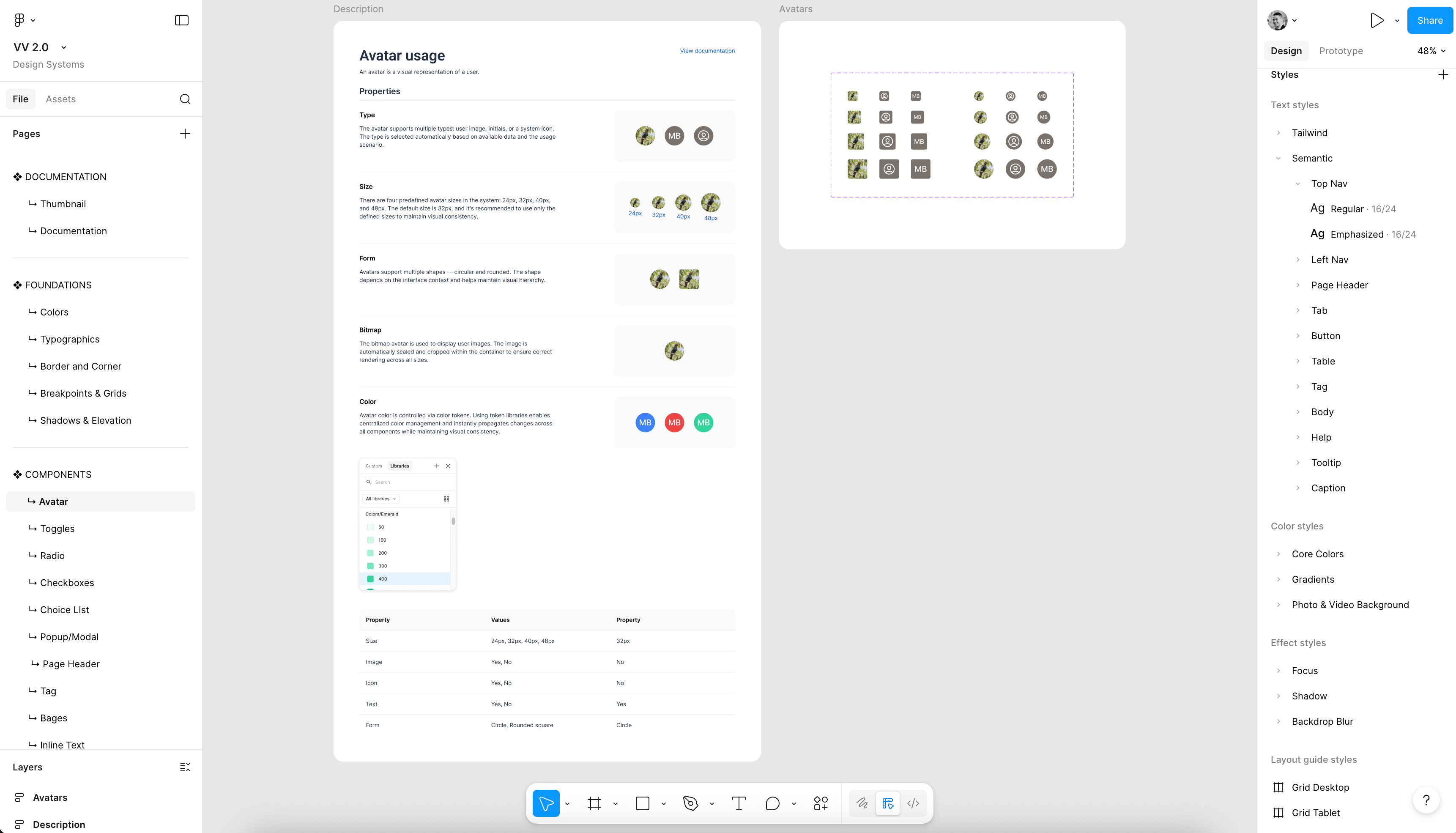
Design System Structure
This is a unified workspace: tokens, styles, components, and documentation are structured by levels and interconnected for easy navigation and maintenance

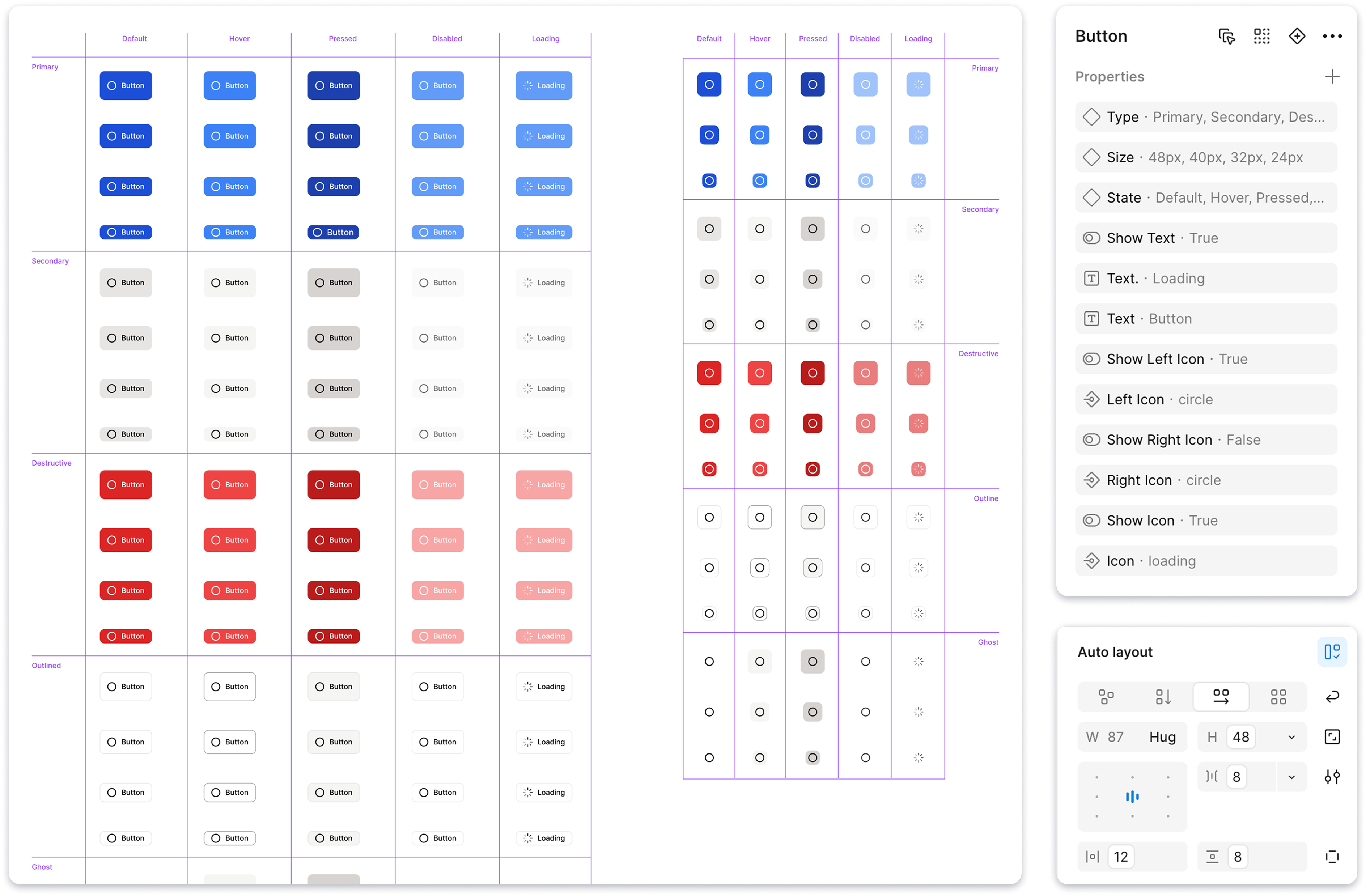
Components
Components are built on tokens and variables and are controlled parametrically. This allows maintaining interface consistency and scaling the design system without increasing structural complexity

Icon Library
A base set of 300+ icons has been created and integrated into the design system. Sizes 16px / 20px / 24px are used as standardized options, ensuring consistent scale and visual alignment across all components. All icons are designed in a unified style
Conclusion
The VV Foundations project became a practical exploration of how a mature design system should work — from token architecture to parametric components and a clear, well-structured foundation. The system was designed to simplify scaling, maintain a unified visual language, and reduce the number of errors
This project strengthened my experience in designing design systems, working with variables and component architecture, and helped me develop a more engineering- and product-oriented approach to design
See also
CRYPTO EXCHANGE
E-COMMERCE PLATFORM
Mobile application
Inspection Platform
Brand identity & logo